|
|
GIS Exercise 20 may 2003 |
Thomas
Gumbricht T.Gumbricht@cgiar.org |
Introduction to GIS and Satellite Data Analysis – Lake Nakuru, Kenya
|
Requirements This exercise requires a PC with Windows 95/98/2000, Windows NT, or
later and the freeware ArcExplorer 2.0. To download and install ArcExplorer
see appendix 1. The necessary data are available on the RELMA_GIS1.0 CD. The
necessary data are available on the RELMA_GIS1.0 CD. Sources of internet
available data are given in appendix 2, and in the document Spatial
Data and Applications for Environmental Studies in Africa. |
|
Recommended prerequisites It is recommended that you do the exercise Introduction
to GIS and digital cartography using ArcExplorer before doing this
exercise. |
|
Objectives This exercise will give an introduction to
GIS and satellite data analysis using the ArcExplorer freeware. To illustrate
the exercise different freely available data over the Nakuru catchment in Kenya
will be used. The objective of the exercise is that the students should gain basic
insight into using GIS and satellite images for analysing natural resources.
After completing the exercise students should understand the usefulness of
GIS and (RS) sensing for natural resources management. |
|
Task To pass this exercise a thematic map over the Nakuru region in Kenya showing important aspects of natural resources should be handed in. |
Start the GIS freeware ArcExplorer and add data
Start ArcExplorer and Save, ![]() the
ArcExplorer project, preferably in your home directory. Change the name into
something logical. Remember to save the project frequently in case you should
cause the program to crash or loose power supply.
the
ArcExplorer project, preferably in your home directory. Change the name into
something logical. Remember to save the project frequently in case you should
cause the program to crash or loose power supply.
The
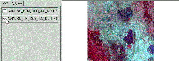
first step is to have a look at two satellite images over the Nakuru catchment
in central Kenya. The older image is from 1973 and is taken by Landsat TM
(Thematic mapper), the second is from 2000 and is taken from Landsat ETM
(Enhanced Thematic Mapper).
The
two images are in the directory …data/spatial/nakuru/images. Use the Add Theme button, ![]() and
add the images by either double clicking or select them and click
and
add the images by either double clicking or select them and click ![]() button in the Add
Theme(s) dialogue box. The images are both composites of three individual bands, composed
to show dense vegetation as red (much like an infrared aerial photograph).
Toggle between the images by clicking the Check box for each image. Use
the Zoom in tool,
button in the Add
Theme(s) dialogue box. The images are both composites of three individual bands, composed
to show dense vegetation as red (much like an infrared aerial photograph).
Toggle between the images by clicking the Check box for each image. Use
the Zoom in tool, ![]() to
zoom to the Eastern Mau forest (see next page). Position the cursor in one
corner of the forest, click and hold down the left mouse button and drag over
the area you want to zoom in to. The stripes in the 1973 image is due to sensor
distortions, do not worry about them. What else do you see when you toggle
between the images?
to
zoom to the Eastern Mau forest (see next page). Position the cursor in one
corner of the forest, click and hold down the left mouse button and drag over
the area you want to zoom in to. The stripes in the 1973 image is due to sensor
distortions, do not worry about them. What else do you see when you toggle
between the images?
Eastern Mau forest Click the Check box to turn on/off a theme![]()
Zoom
in until you can see the individual picture
elements (‘pixels’, rasters or
cells) that compose the satellite image. Measure the resolution (‘size’) of a
single pixel by making use of the Measure tool, ![]() . Remember that for using the Measure tool you must define both the Scale bar
Properties (under View in the menu) and the Measure unit (under Tool in the menu). The pixel
resolution is 30 m in both images, but the distortions in the 1973 make it
appear to be double that. The image data is a continuous dataset with values
representing ‘fields’ of color (or reflections as the jargon goes). Most maps,
however, display object classes – instead of ‘redness’ we rather talk about
discrete objects like forests, towns etc. Compare the satellite image over the
Nakuru area with an ‘object’ map of the forests the area. Use the Add Theme button,
. Remember that for using the Measure tool you must define both the Scale bar
Properties (under View in the menu) and the Measure unit (under Tool in the menu). The pixel
resolution is 30 m in both images, but the distortions in the 1973 make it
appear to be double that. The image data is a continuous dataset with values
representing ‘fields’ of color (or reflections as the jargon goes). Most maps,
however, display object classes – instead of ‘redness’ we rather talk about
discrete objects like forests, towns etc. Compare the satellite image over the
Nakuru area with an ‘object’ map of the forests the area. Use the Add Theme button, ![]() to add the Kenya map of forests over Nakuru –
you find two maps in the …data/spatial/nakuru/landcover directory. One map shows the ‘official’ extent of the forest (nakuru_forest_cover_dewa),
the other is a more recent update (nakuru_forest_cover_excisions_dewa_rev3)
done by UNEP.
to add the Kenya map of forests over Nakuru –
you find two maps in the …data/spatial/nakuru/landcover directory. One map shows the ‘official’ extent of the forest (nakuru_forest_cover_dewa),
the other is a more recent update (nakuru_forest_cover_excisions_dewa_rev3)
done by UNEP.
Put the forest themes above the satellite images by dragging them to
the top of the Legend with the mouse (or point at them, right click the mouse
and use the Move theme option in the pop-up menu). Click the Check
box
for each forest theme. By default a polygon object theme is filled with a
single color, and hence covers any theme below in the Legend. To see the
satellite images ‘under’ the forest theme you must use the Theme
Properties dialogue, which you reach either double clicking on the name label of
the theme, or making the theme active by clicking once on the name label (it
then appears lifted) and then click on the Theme
Properties tool, ![]() . In the Theme
Properties dialogue set Style to be Transparent
Fill,
set Size (for outline) to 2, and select to different colors
that will match the satellite background image for each forest theme. Zoom in
using the Zoom in tool,
. In the Theme
Properties dialogue set Style to be Transparent
Fill,
set Size (for outline) to 2, and select to different colors
that will match the satellite background image for each forest theme. Zoom in
using the Zoom in tool, ![]() and
then Pan,
and
then Pan, ![]() around to check the accuracies of the object forest maps.
around to check the accuracies of the object forest maps.
|
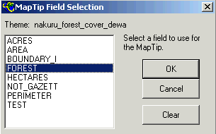
The different forests in
the map have different names, and we want those names to appear. Make sure
that the ‘official’ forest map is the active theme (i.e. appears lifted) and
click the MapTips tool, |
|
Add a Digital Elevation Model (DEM)
Elevation data in GIS can be in three different formats, as contour
lines and spot heights, as triangular irregular networks (TIN) or as raster
data. Contour lines is how elevation is usually presented on topographic maps
(sometimes with additional hillshading). TIN is the format elevation data is
collected from trigonometric surveys. Raster is the preferred data model for
doing mathematical analyses and map algebra.
|
Start by adding contour lines and spot heights. Again make use of the
Add Theme button, |
|
Because we have the satellite image as a backdrop it is quite easy (but
not totally clear) to see which contours are higher and which are lower. But if
you turn off the satellite images by deselecting their Check
boxes
it becomes much more difficult, or impossible rather. Hence we must add text to
the contours and spot heights. Text on a contour line should always be on the
‘upper side’ of the line.
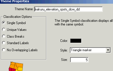
ArcExplorer is a simple GIS, so the options for labelling are not
great. But try to put some text on both the contour lines and the spot heights.
As the symbols are not unique (both respective themes are symbolized using a
single setting for all records) we do not need to duplicate the themes (which
is needed if the symbolising is uique). Try to find a symbolizing that looks
OK, by selecting various options related to either Standard
Labels
or No Overlapping Labels.
Try different options for labeling the contour lines and spot
heights Use Meters as text field Try out Standard Labels and No Overlapping Labels.![]()
![]()

![]()
![]()
![]()
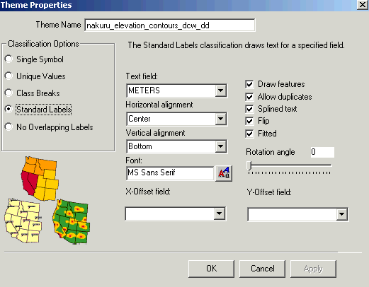
The contour lines were originally done in feet, so the elevation in
meters is a bit unlogical. But it should be obvious that one of the forests is
situated in a depression whereas the others are in high areas and on steep
slopes. That is also the reason why the spectral properties (i.e. colors in the
satellite images) are differs.
What is the name of the forest in a depression? To find that out you
can either make the ‘offical’ forest theme active and drag the moue over that
forest, in which case the MapTips tool should give the answer as a small pop-up
text, or you can activate that theme and use the Information tool, ![]() and
click in that forest. The correct answer is the Menengai forest.
and
click in that forest. The correct answer is the Menengai forest.
Now it is time to add the raster DEM. A raster DEM is also a field data
set with continuous variation in space. Most GIS systems, however, separate
between image data (where the actual values in raster has no physical meaning,
it only relates to a color scheme) and grid data (where the field values of the
raster have a direct physical meaning). The way images and grids are stored is
hence different. To add the grid DEM over Nakuru make use of the Add
Theme
button, ![]() , and navigate to …data/spatial/nakuru/DEM/nak_gtopo30. Nak_gtopo30 is the name of
the theme (but it is not a file), but to get hold of the actual raster we must
go down to the level of the actual grid related to that theme – the grid has a
standard name – hdr.adf (regardless of content). Add this grid. As you
see the name in the Legend becomes nak_gtopo30. Make sure the DEM grid is at the bottom of
the legend and turn it on by clicking the Check box. ArcExplorer can
only display (continuous field) grids in black and white, with white
representing high values and black low values. It is now very apparent which
forest is a lowland forest. What is the spatial resolution of the grid DEM?
, and navigate to …data/spatial/nakuru/DEM/nak_gtopo30. Nak_gtopo30 is the name of
the theme (but it is not a file), but to get hold of the actual raster we must
go down to the level of the actual grid related to that theme – the grid has a
standard name – hdr.adf (regardless of content). Add this grid. As you
see the name in the Legend becomes nak_gtopo30. Make sure the DEM grid is at the bottom of
the legend and turn it on by clicking the Check box. ArcExplorer can
only display (continuous field) grids in black and white, with white
representing high values and black low values. It is now very apparent which
forest is a lowland forest. What is the spatial resolution of the grid DEM?
Zoom to Full Extent, ![]() and
note the flat area (area with homogenous gray color) in the center of the map.
This flat area is where Lake Nakuru is situated. To check out the extent of
Lake Nakuru turn on one of the satellite image themes by clicking the check
box. You can not see the Lake and the DEM at the same time as both themes cover
the whole area. In order to see both the Lake and the DEM simultaneously we
must add the Lake as an object. Use the Add Theme button,
and
note the flat area (area with homogenous gray color) in the center of the map.
This flat area is where Lake Nakuru is situated. To check out the extent of
Lake Nakuru turn on one of the satellite image themes by clicking the check
box. You can not see the Lake and the DEM at the same time as both themes cover
the whole area. In order to see both the Lake and the DEM simultaneously we
must add the Lake as an object. Use the Add Theme button, ![]() and
navigate to …data/spatial/nakuru/hydro, the lake is in the theme Nakuru_lakes_dcw_dd.
and
navigate to …data/spatial/nakuru/hydro, the lake is in the theme Nakuru_lakes_dcw_dd.
Open the Theme Properties dialogue to make the Style a Transparent
Fill,
change the color of the outline to blue and Size to 2. Make sure that the Lake
theme is Active (i.e. appears lifted) and Zoom to
Active Theme, ![]() . Your ArcExplorer project should now look
like the image below.
. Your ArcExplorer project should now look
like the image below.
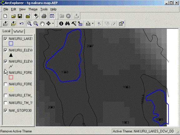
Apart from Lake Nakuru, there is also part of another lake in the view.
Use the Information tool, ![]() to
find out the name of this second Lake (make sure that the lake theme is the
Active theme).
to
find out the name of this second Lake (make sure that the lake theme is the
Active theme).
You can see that the data does not fit perfectly; there are geometrical
errors. The Lake theme and the DEM themes are, however both captured from
datasets with global coverage. This means that for any part of the globe you
can get this kind of information. Also the satellite images used are globally
available. The best part of it is that all this data is for free (the satellite
images only for Africa) via the internet (see appendix 2).
Zoom to Full Extent, ![]() . Add the other themes available under …data/spatial/nakuru/hydro (nakuru_basin_dewa_dd and nakuru_rivers_dewa_dd) to the project.
Change the symbolizing to better colors and set the Style of the basin to Transparent
Fill
(done via the Theme Properties dialogue, accessed via
double clicking the Theme menu item or from the tool bar,
. Add the other themes available under …data/spatial/nakuru/hydro (nakuru_basin_dewa_dd and nakuru_rivers_dewa_dd) to the project.
Change the symbolizing to better colors and set the Style of the basin to Transparent
Fill
(done via the Theme Properties dialogue, accessed via
double clicking the Theme menu item or from the tool bar, ![]() ).
).
Notice anything peculiar with Lake Nakuru? It has no outlet!
To check the geometrical accuracy of the different themes, turn on the
2000 satellite image by clicking its Check box. Zoom in to
region between the Eastern Mau forest and Lake Nakuru – there is positional
mismatch between the satellite image and the river theme. How large is this
mismatch? Use the Measure Tool, ![]() to
find out.
to
find out.
Positional mismatch Measure Tool
![]()
![]()
![]()

Zoom to Full Extent, ![]() and
turn off all themes except the grid DEM, the river and the basin. From a
regional perspective it is clear that the datasets fit quite nicely. The rivers
drain the mountains surrounding Lake Nakuru, and the basin delineates an
internal drainage basin.
and
turn off all themes except the grid DEM, the river and the basin. From a
regional perspective it is clear that the datasets fit quite nicely. The rivers
drain the mountains surrounding Lake Nakuru, and the basin delineates an
internal drainage basin.
Socioeconomic
aspects
The two satellite images quite strongly suggest a substantial loss of
forest in the upper parts of the Nakuru basin. Let us have a closer look around
the Lake itself before turning to some socio-economic data.
The lake and its near shore area is a protected area, add the theme for
this area, nakuru_limitnaku_lake_dd, that you find
under …data/spatial/nakuru/nat_parks (use Add Theme, ![]() ). Use the Theme
Properties dialogue box to set Style to Transparent
Fill,
and select a suitable color for the outline. Make sure the theme is active and
Zoom to Active Theme,
). Use the Theme
Properties dialogue box to set Style to Transparent
Fill,
and select a suitable color for the outline. Make sure the theme is active and
Zoom to Active Theme, ![]() . Turn on the satellite image from 2000.
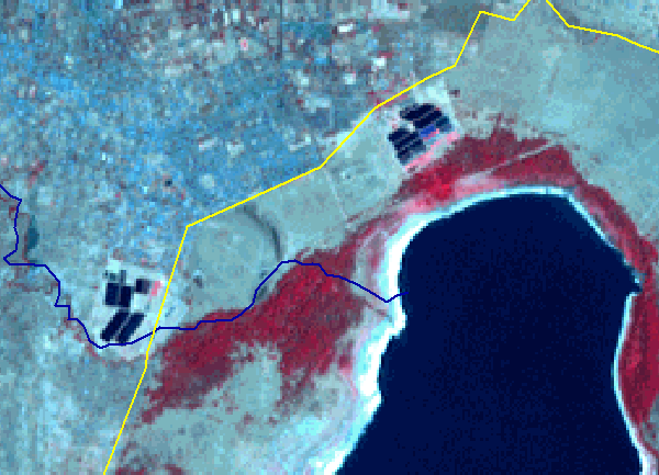
There is a distinct difference in tone and texture in the satellite image
between the inside and outside of the park boundary. If you toggle between the
1973 and 2000 satellite images, the changes does not seem to be severe – only
an apparent encroachment north of the Lake – which looks like a series of water
filled squares; my best guess is a water treatment plant. If you look just
outside the park boundaries there are only very small remnants of forests (i.e.
red areas) left along the rivers as narrow strips of riparian strips. Also note
how the settlements north of the lake seems to be much more dense in 2000
compared to 1973.
. Turn on the satellite image from 2000.
There is a distinct difference in tone and texture in the satellite image
between the inside and outside of the park boundary. If you toggle between the
1973 and 2000 satellite images, the changes does not seem to be severe – only
an apparent encroachment north of the Lake – which looks like a series of water
filled squares; my best guess is a water treatment plant. If you look just
outside the park boundaries there are only very small remnants of forests (i.e.
red areas) left along the rivers as narrow strips of riparian strips. Also note
how the settlements north of the lake seems to be much more dense in 2000
compared to 1973.
Area with settlements Encroachment? Probably water treatment plant Thin riparian forest outside park Park boundary Forests around the lake
![]()
![]()
![]()
![]()
![]()

![]()
Now it is time to have a look at some infrastructure and socio-economic
datasets to see what we can learn.
Start by adding the themes for roads (nakuru_roads_dcw_dd) and
the theme showing the area of the town of Nakuru (nakuru_nakuru_town_dcw_dd).
Both themes are in the directory …data/spatial/nakuru/infrastructure. The dense settlements north
of the Lake are obviously there because it neighbors the town of Nakuru. The
water treatment plant must be for the town, and was obviously built sometimes
between 1973 and 2000.
A recent population dataset with global coverage is the Landscan 2000
dataset (see appendix 2), it is a grid theme and the part of this dataset
covering our study area is available under …data/spatial/nakuru/population\nak_landscan. Add this theme, put it
below the satellite image themes and make it active. Have a look at it by
turning off the satellite image themes (deselect the Check
boxes)
and turn the Landscan population theme on. Use the Theme
Properties dialogue to create a Color ramp for the population density. Remove the
outline (as shown below) to make it easier to see the population density.
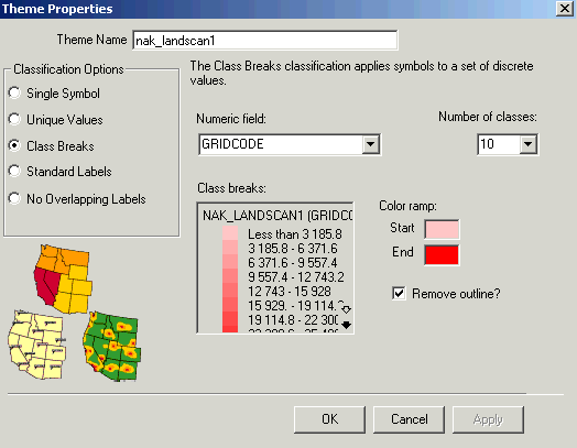
Turn off the Landscan population theme and turn on the satellite image
from 2000 by clicking the Check boxes for those
themes.
|
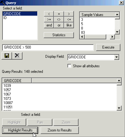
Make sure the Landscan population theme is active and use the Query tool, |
|
On the RELMA_GIS1.0 CD there is more socio-economic data available on a
ward level. The polygon theme containing the wards is under …data/spatial/nakuru/population\political\nakuru_wards_depha_dd. Put the theme on top of the
Legend and use the Theme Properties dialogue to make the fill transparent
and the outline black with thickness 2. Then use the Information tool, ![]() to
look at the data records for some of the wards.
to
look at the data records for some of the wards.
|
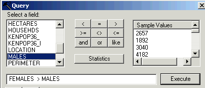
The database contains around 20 records, including the number of
males and females in each ward. Use the Query tool, |
|
Save, ![]() the
ArcExplorer project that you have created, preferably in your home directory.
Change the name into something logical.
the
ArcExplorer project that you have created, preferably in your home directory.
Change the name into something logical.
Your turn
To complete the exercise
you create a thematic layout of your own choice with at least one theme
contributing to labeling the map.
When you are
satisfied with your cartographic product it is time to transfer to another
media. Either print it,
|
|
Appendix 1: How to get ArcExplorer
from the internet
Use a web-browser (Netscape, Internet explorer) and navigate to ESRI´s
homepage (http://www.esri.com) and to the page
with free resources (in the blue field to the left, you have to scroll down get
to Free Resources), select ArcExplorer (you should then be
transferred to the site http://www.esri.com/software/arcexplorer/index.html).
Read about ArcExplorer and then press Download
(version
2.0 is the latest at the time of writing this instruction). You should then be
transferred to the page http://www.esri.com/software/arcexplorer/aedownload.html.
Download the file ae2seup.exe, also download the User Guide, arcexplorer.pdf.
Close all windows applications that are
running on your PC and install ArcExplorer by executing the program ae2setup.exe
(the program that you downloaded). To be able to install ArcExplorer you must
have administrative rights on the computer you are using – if you do not have
that you must ask your system administrator to help you. To install and run
ArcExplorer the user should have full access (read and write) to the archive
C:\Esri\ (not only for installation – also for running). When you install the
ArcExplorer the default path for installation is “Program files\ESRI\ArcExplorer”. It is recommended that you accept
that.
If you get stuck or do not understand a command, please refer to the User Guide that you downloaded (arcexplorer.pdf). This document is in pdf format, which you can read using Adobe acrobate reader. If you do not have acrobat reader on your computer you can download it from http://www.adobe.com. Installation is done in a similar manner as the ArcExplorer installation described above.
Appendix 2: Free data from the
internet used in this exercise
For more comprehensive information on data available over the internet
see the document Spatial Data and Applications for Environmental Studies in
Africa. The exercise GIS
Data Mining on Internet introduces using ArcExplorer for direct linking to
map resources on the internet. It also includes examples of how to find and
download other datasets, including Digital Chart of the World (DCW), which is a
comprehensive dataset with global coverage. DCW data covering the RELMA
countries (Uganda, Ethiopia, Eritrea, Tanzania, Kenya and Zambia) is available
on the RELMA_GIS1.0 CD (under …data/spatial/DCW). To import the DCW to
ArcExplorer you must use special software (Import71), which is also supplied on
the RELMA_GIS1.0 CD. It is however not trivial to import this data, but you can
find the instructions in the exercise Data Mining on Internet.

