|
|
GIS Exercise 20 may 2003 |
Thomas
Gumbricht T.Gumbricht@cgiar.org |
Introduction to Modeling and Decision Support in GIS – Lake Nakuru, Kenya
|
Requirements This exercise requires a PC with Windows 95/98/2000, Windows NT, or
later and the freeware DIVA GIS 2.5. To download and install DIVA GIS see
appendix 1. The necessary data are available on the RELMA_GIS1.0 CD. Sources
of internet available data are given in appendix 2, and in the document Spatial
Data and Applications for Environmental Studies in Africa. |
Recommended prerequisites
It is recommended that you do the exercise GIS
and satellite image data analysis – Lake Nakuru, Kenya before doing this exercise. |
|
Objectives This exercise will give an introduction to
vector and data raster models, map algebra and modeling in GIS, and GIS as a
tool for decision support. The objective of the exercise is that the students
should gain insight into GIS as a more advanced tool for natural resource
management, and for solving spatial allocation problems. After completing the
exercise students should understand the concepts of vector and raster data,
and the applicability of GIS for modelling, and for decision support. |
|
Task To pass the exercise a map showing suitability for commercial agriculture in the Nakuru region, Kenya, should be handed in. |
Move the Nakuru database
to your harddrive
In this exercise you will create several new
map layers. Hence the database must be in a directory where you can not only
read the data, but also write data. The database is on the RELMA_GIS1.0 CD in
the directory …data/spatial/nakuru. To have access
to the whole database it is recommended that you copy the whole database on the
RELMA_GIS1.0 (…data/) to your harddrive. By doing
so you will also preserve the directory tree structure as it is given
throughout this exercise.
Start the GIS freeware DIVA and add data
In this exercise we will use DIVA, ![]() - a
GIS freeware from The International Potato Center (CIP) – see appendix 1 for instructions on how to retrieve DIVA
from the internet and set it up. If the DIVA icon is not on your desktop you
can find it on the Desktop via Start -
Programs - DIVA-GIS - DIVA. The
source program is under C:\Program Files
\DIVA-GIS\DIVA. Start DIVA.
- a
GIS freeware from The International Potato Center (CIP) – see appendix 1 for instructions on how to retrieve DIVA
from the internet and set it up. If the DIVA icon is not on your desktop you
can find it on the Desktop via Start -
Programs - DIVA-GIS - DIVA. The
source program is under C:\Program Files
\DIVA-GIS\DIVA. Start DIVA.
The main parts of the DIVA interface are shown in the figure below. You
will be presented with an empty project. The user manual for DIVA (DIVA-GIS2b.pdf)
is available on the RELMA_GIS1.0 CD and also in the same folder as the program
file. This manual can be read by using Adobe Acrobat reader (see appendix 1 for
download of Adobe Acrobat).
In the interface you will notice that some menu and tool items are gray
(fuzzy) that means that they are not available at the moment. Many items
require that you have some themes in the view, (a theme is a maplayer
in GIS jargong) and some that you have at least one theme active (this will
soon be clear to you).
|
Map View Legend Menu bar Tool bars |
|
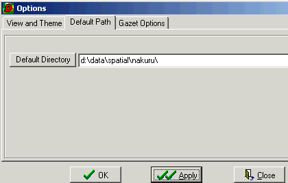
Before adding map layers you should set the default directory of the
project. The data you will use is under …data/spatial/nakuru on the RELMA_GISCD1.0.
Click Tools in the Menu bar and then General
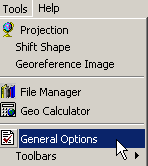
Options in the Pop-up menu, as shown to the right. In the Options dialogue you can set the Default Directory as shown below.
Under the tabs you can set other general options.
|
|
Save the DIVA project, ![]() give
it a logical name. Remember to save the project frequently in case you should
cause the program to crash or loose power supply.
give
it a logical name. Remember to save the project frequently in case you should
cause the program to crash or loose power supply.
|
Now we are ready to add some maps from the RELMA_GIS1.0 CD. Press the
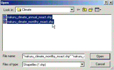
Add theme button, (…data/spatial/nakuru). Go to the Climate directory and add the two shape files with climate data. You can select both by holding down Ctrl+Shift on the keyboard and clicking the files. Click Open. |
|
|
The two climate shape files both consist of rectangular polygon
records with associated databases containing climate statistics. By default
the added themes are turned on (i.e. the Check
Box
is marked), but this can be changed in the Options dialogue where you set the
Default Directory. |
Active theme appears elevated Check box |
|
To get a reference to the area you are working with you must add a
backdrop image. Use the Add
theme button, |
|
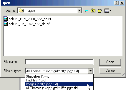
There are two Landsat satellite images available. Add the one from
2000. Move the image theme to the bottom of the legend by using the mouse to
drag and drop it. The Tools for zoom and pan in DIVA looks different from
ArcExplorer, ![]() and
also include more advanced options. Zoom in,
and
also include more advanced options. Zoom in, ![]() to
the satellite images and try out the Zoom and Pan tools.
to
the satellite images and try out the Zoom and Pan tools.
Attribute
data
Make sure that the annual climate theme is active (i.e. appears
elevated).
|
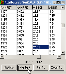
Use the Identify tool, Use the Statistics button to calculate average precipitation
over the study area. In the Statistic
dialogue box scroll down to ANNPRE and select it. The annual precipitation
for the area is 844 mm. |
|
Each record (or shape in this case) in the vector file (whether point,
line or polygon – see below) is associated with a record (‘rows’) in the
attribute table. For each record there is a number of fields (‘columns’) with
different attributes. This is a simple but often sufficient form of database
connection used in all vector data GIS models.
Symbolizing
data
By default DIVA displays polygons with transparent fill and black
outlines. You shall now create a color ramp for symbolizing the rainfall
pattern of Nakuru. This is done from the Properties
and Symbol dialogue that you open either via the Symbol
tool,
![]() , by double clicking the theme in the Legend,
or from the pop-up menu under Theme in menu bar.
, by double clicking the theme in the Legend,
or from the pop-up menu under Theme in menu bar.
|
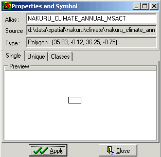
There are three tabs in the Properties and Symbol dialogue. First
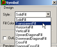
you must change the Fill and Outline from the Single Tab. Double click the rectangle in the Preview window to access the Symbol dialogue, deselect the Check box for Outline and choose Solid
Fill
from the pop-up menu.
|
|
|
Click Apply in the Symbol dialogue and
then Apply in the Properties and Symbol dialogue. (If
you still see the polygon outlines it is probably because you did not
deselect the check box for the monthly climate theme in the Legend). To create
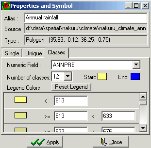
a color ramp for annual precipitation click the Classes tab in the Properties and Symbol dialogue. Change the Alias to Annual
rainfall. Select ANNPRE as Numeric Field, and set the
number of classes to 12. Double click on the rectangle for Start color. Select a yellow color in the Color dialogue that pops up and
click OK. Select a blue color for End. Then click Reset Legend in the Properties and Symbol dialogue.
Finally click Apply. You should now have a map and legend with a ramp
of colors symbolizing precipitation. |
|
Query
the database
For agriculture it is not only the total annual precipitation that is
of interest, also the distribution over the year is important. In Nakuru there
are two rainy seasons per year, April to May, and July to August. For successful
rainfed crop growth it is necessary that precipitation during these four months
of rain exceed 100 mm per month. To find out which areas in the map that have
sufficient rainfall you must use a query. Make sure that the monthly climate
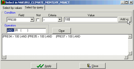
theme is active and click the Select Record tool, ![]() . In the Selection dialogue click the Select
by Query tab. Select Field to be PRE04, set
criteria to > and enter 100 for Value. Click the Add
button.
Then click the AND operator and enter the same conditions but for month
5, 7 and 8. Click Apply.
. In the Selection dialogue click the Select
by Query tab. Select Field to be PRE04, set
criteria to > and enter 100 for Value. Click the Add
button.
Then click the AND operator and enter the same conditions but for month
5, 7 and 8. Click Apply.
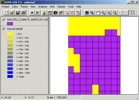
Your map should now look like the example below, where the yellow areas
denote those with sufficient precipitation for rainfed agriculture.
Vector
vs Raster data
|
DIVA can handle both vector and raster data. Use the Add Theme button, |
|
be grid. Add both grids.The grid themes cover (almost) the same area as
the shape files; the grid files however do not have any attribute table.
|
To have a look at the difference between shape and grid files you
must add some more map themes. Use the Add
Theme button, Vector data can be of three types: Points (i.e. a city on a small scale map, or a well on a large scale map), Lines (i.e. roads or rivers), or Polygons (i.e. watersheds or political units) Vectors are associated with attribute data (tables or databases in
GIS jargon). The precision of vector data is better, but for map algebra, map
calculations and GIS modeling, raster data is easier to use. Remember that
satellite data is also in a raster format, and more and more used for mapping
and map updating. |
|
Digital Elevation Models (DEM)
Digital elevation models are widely used for modeling e.g. hydrology
and erosion in GIS (and other software). Elevation data in GIS can be in three
different formats, as contour lines and spot heights, as triangular irregular
networks (TIN) or as raster data. Contour lines are how elevation is usually
presented on topographic maps (sometimes with additional hillshading). TIN is
the format elevation data is collected from trigonometric surveys. Raster is
the preferred data model for doing mathematical analyses and map algebra.
One important landscape character that can be computed from a DEM is
slope (steepness) which influences both runoff and erosion. Use the Add
Theme
button, ![]() to
add the raster Dem and the derived slope map, both available in the DEM
directory. By default DIVA displays continuous raster themes with five colors.
to
add the raster Dem and the derived slope map, both available in the DEM
directory. By default DIVA displays continuous raster themes with five colors.
|
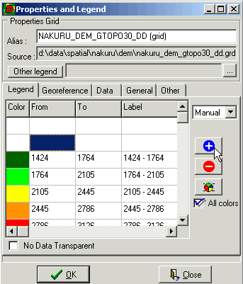
Change the color ramp for
symbolizing the DEM and slope by using the Properties and Legend for grids
dialogue that you open either via the Symbol tool, |
|
|
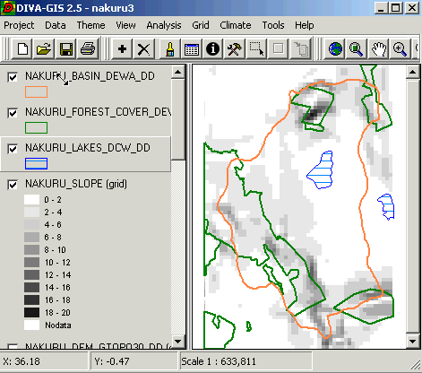
Add the shape themes for Lake Nakuru and its basin (in the Hydro
directory) and for forest areas (in the Landcover directory). Put them
on top of the grid theme for slope, and turn on these three themes. Symbolize
them; in the example to the right the Lake theme has a Horizontal Fill in order for the underlying slope theme to be
visible also ‘under’ the lakes. The other polygons have a Transparent Fill. The lake is in a flat area, whereas the forests
are found in the steeper parts of the catchment. |
|
Regression
analysis
Both the rainfall and the topography in the basin vary quite a lot over
a rather small area. To see whether there is any correlation between the two
themes (possibly caused by orographic precipitation over the mountains) we will
use regression analysis. Click on the DEM grid theme to make it active, then
click Analysis in the menu bar and select Regression from the
drop-down menu. DEM should now be the Grid in X, click the Grid
in Y
button and select the grid with annual precipitation data as Y variable. Do the
regression by clicking Apply. Have a look at the chart
and the result. What is the coefficient of determination? Charting data is a
standard procedure for displaying the properties of spatial data in a more comprehensive
form.

Reclassification
To reclassify grid images is a common operation in GIS. To illustrate
that you will use grid themes of soils and geology. Add both the shape and the
grid theme for soil (under the Soil directory). Put the shape theme on
top of the grid theme so you can se the outlines of shape file, and make the
shape file the active theme to get information on the records in the shape. Use
the Identify tool, ![]() to
look at the records in the soil database. The soil grid theme is made from the DOM1
field in the database.
to
look at the records in the soil database. The soil grid theme is made from the DOM1
field in the database.
|
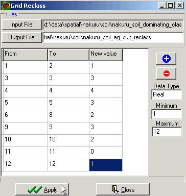
Make the grid soil theme the active theme. Click Grid in the theme menu, and choose Reclass in the
drop-down menu. The reclass that you will do should reflect the soil types
suitability for agriculture (higher value = higher suitability). First enter
a name for the Output File, you must include the
full path. Then reclass the soils, you can follow the example to the right or
use your own soil knowledge to do the classification. Add classification rows
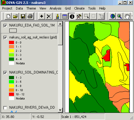
by clicking the Insert button, Put the shape soil theme over the ‘soil suitability for agriculture’
map. Below is an example of how it could look. |
|
In a similar way also reclass the geology and slope maps into
suitability maps for agriculture. As a hint eolian deposits are the most poor,
and then usually younger intrusive rocks are better than older. The slope map
derived from the DEM that you used above have higher classes for higher slopes,
whereas agriculture is more suitable on flat terrain (e.g. for erosion risk
purposes). You must hence invert the slope map. The slope is a continuous map
from 0 to 20 degrees, but we only want 4 classes for our suitability analysis.
Classify the maps into a maximum value of four. These maps will be needed for
the decision support later in the exercise.
Map
filtering, map algebra and expert modeling
Using algebra to derive new themes is also a common method used in GIS.
Above you queried the database for locating areas suitable for rainfed
agriculture defined as those areas where you have more than 100 mm of rainfall
per month during the two rainy seasons. Another factor that will influence the
suitability for agriculture is the amount of water available per capita in an
area. If the water demands for domestic use is large, it is unlikely that water
harvesting for irrigation will be possible. As there are map themes of
population and precipitation available on the RELMA_GIS1.0 CD we can use map
algebra for finding out the water availability for irrigation.
Add the grid theme with population data from Landscan (under the Population
directory). Put the population map and the annual rainfall maps on top in the
Legend. If you toggle between them you can see that the spatial resolution is
apparently higher in the population data. The rainfall data set has from a
technical GIS perspective the same resolution, but it is derived from a more
low-resolution data set (the climate shape file you used in the beginning).
|
To smooth the crispness of the annual rainfall grid, you shall use a
neighborhood filtering process. This means that the value of a single pixel
will be assigned the average value of its neighborhood (including self). With
the annual rainfall theme selected click Analysis in the menu
bar and then Neighborhood from the Drop-down menu.
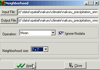
Give a name for the Output File, set Operation to Mean and Neighborhood size to 7x7, and Apply. |
|
|
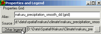
Add the new grid theme to the Map View. To change its color ramp to
the same as that for the original precipitation map open the, open the Properties and Legend dialogue, click the Other
legend button and select the original precipitation map. Click OK. |
|
The smoothed (or filtered) rainfall map theme now looks more less
crisp.
You should now be ready to make the map calculation that will reveal
water availability per capita in the Nakuru area. To be able to translate
precipitation in mm to cubic meters (m3) per cell you must know the
surface area of each cell, which is 1 km2. The conversion factor is
hence 1000 (=1000 m * 1000 m * 0.001 m). Hence each mm of rain will generate
1000 m3 of water per cell (km2). However, as a rule of
thumb we can assume that approximately 50 % of the rainfall can not be utilized
due to evaporation and other losses. The basic water need is around 20 liters
per person and day, going up to 100 liters in more developed regions, and
perhaps 300 liters in industrialized regions. Let us assume a water need of 50
liters per person per day before any water can be used for irrigation. 50
liters per day translates to 18250 per year. With these figures we can write
the complete formula for water availability for agriculture (expressed in mm
per year):
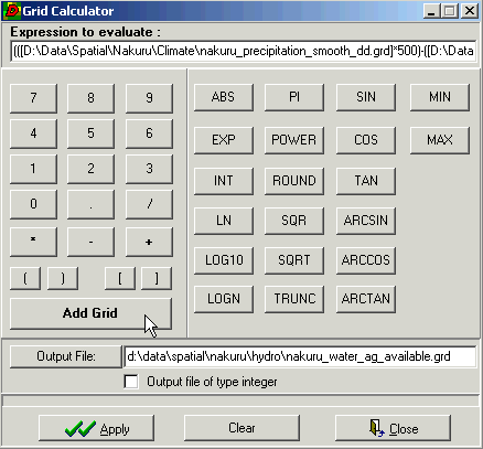
(([precipitation]*500)-([population]*18250))/1000
|
Click on Grid in the menu bar and select Calculate in the drop-down menu. Write the formula shown above as the Expression to evaluate. You must include the parentheses. The two grid
themes can be entered using the Add Grid button. Give
an Output File with full path, in the example it is put in the Hydro
directory. Click Apply, and add the new grid theme to the Map View. |
|
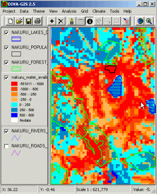
Change the color ramp for the
water availability theme to representative colors, and put some of the shape
themes on top to get a better understanding of the water availability, as in
the example below.
|
The agricultural water availability map is an example of a data (or
forward) driven expert generated map. The algorithm you used for deriving the
map was based on (expert) knowledge of - Rainfall - Evaporation - Population, and - Per capita water use, as well as knowledge on how to combine these in a ‘model’. Also the
method for identifying areas suitable for rainfed agriculture above is an
example of a forward driven expert system. |
|
Decision
Support and Multi Criteria Evaluation
To derive at a decision tool using GIS usually involves many steps.
This is true both for the conceptual work of defining what decision criteria to
use, and also how to represent and weigh these criteria in the GIS. To fully
understand how a map can be created that represents the evaluation of multiple
criteria you should follow this section in detail. As this will involve many
GIS processing steps it will take some time. Hence you can instead read through
the text and only execute the formula given towards the end of this section.
You can simply copy this formula and paste it into the Grid
Calculator.
In this exercise you have created a set of maps that now can be used as
Decision Support for identifying areas suitable for agricultural
commercialization in the Nakuru area. In your project you should now have the
following ‘suitability’ or ‘decision criteria’ maps:
Rainfed agriculture
Soil
Geology
Slope
Water availability
Apart from those decision factors, commercial farming is also
dependent on access to markets. Two additional decision factors hence are:
Proximity (distance) to Nakuru town
Proximity to road network
But there are also other criteria that must be included, namely maps
that contain constraints that will either allow or forbid agriculture.
One type of constraint is obviously land cover – it is difficult to have
agriculture in lakes. Land use is another constraint; to have agriculture in
the town of Nakuru is also not possible. There are also legal constraints;
agriculture is not allowed in the lake protected area or in the protected
forest. This gives us the following list of constraints:
Water areas
Urban areas
Protected areas (lake shores and natural forests)
The constraints are straight forward to use, they are Boolean factors
either allowing (1) or forbidding (1) the activity to be evaluated. Note
however that the original maps showing lakes, towns and protected areas need to
be inverted as they (logically) have the numerical value of one (1) for the features they contain. Hence
you must reclass the four map layers to have a value of 0 for the feature
(forbidden area) and 1 for all other (allowed) areas.
The factors have ordinary scales (in our case from 1 to 4), and you
must also set weight to the factors so as to reflect their relative importance vis-a-vis
each other. This can be done in a variety of ways, but usually involves
participatory discussion panels. In this sense decision support systems are
more participatory than expert models.
As we have multiple criteria for identifying suitable areas for
agriculture you will use Multi Criteria Evaluation (MCE). As you will be
looking for the most suitable area in a relative sense, there will always
be a result. Even if there are no absolutely really suitable areas, you
will still find some areas. In this sense most decision support systems, or
tools are goal driven (as opposed to being data driven).
Before setting weights and running the MCE you must prepare some more
maps. The Rainfed agriculture suitability map is a constraint map is it now
stands (the map values are 0/1). It is suggested that you change this into a
factor map by reclass (or grid calculation). For example set suitable areas (1)
to 4 and unsuitable areas (0) to 1. Then you must reclass the Water
availability map into 4 classes. Then you must also add and reclass the two
proximity maps. They are in the directory Proximity. Proximity (or
distance) analysis is a standard GIS method, but not supported by the DIVA GIS
freeware. Reclass also the proximity maps to have values between 1 and 4.
The only thing that now remains before running the MCE is to decide on
factor weights. Use weights between 1 and 10. The following table is an example
of weights.
|
Factor |
Weight |
|
Rainfed agriculture |
5 |
|
Soil |
8 |
|
Geology |
1 |
|
Slope |
4 |
|
Water availability |
6 |
|
Proximity to Nakuru town |
2 |
|
Proximity to road network |
3 |
As computers do not have an exact precision in carrying large numbers
between calculations, there might be a problem executing the formula. Also you
might have done some mistakes, which likewise might cause the MCE formula to
not execute. To simplify matters all the constraint and factor criteria are
available in the MCE directory. Use the Grid
Calculator to execute the MCE. The formula derived from assigning the given
weights for the map layers in the MCE directory is given below. If you
want to make a shortcut just copy the formula below and paste it into the Expression
to evaluate window in the Grid Calculator.
([D:\Data\Spatial\Nakuru\MCE\nakuru_distance_to_nakuru_ag_suit.grd]*2+[D:\Data\Spatial\Nakuru\MCE\nakuru_distance_to_roads_ag_suit.grd]*3+[D:\Data\Spatial\Nakuru\MCE\nakuru_geology_ag_suit.grd]+[D:\Data\Spatial\Nakuru\MCE\nakuru_rainfed_ag_suit.grd]*5+[D:\Data\Spatial\Nakuru\MCE\nakuru_slope_ag_suit.grd]*4+[D:\Data\Spatial\Nakuru\MCE\nakuru_soil_ag_suit.grd]*8+[D:\Data\Spatial\Nakuru\MCE\nakuru_water_ag_suit.grd]*6)*[D:\Data\Spatial\Nakuru\MCE\nakuru_forest_con.grd]*[D:\Data\Spatial\Nakuru\MCE\nakuru_lake_protected_con.grd]*[D:\Data\Spatial\Nakuru\MCE\nakuru_nakuru_town_con.grd]*[D:\Data\Spatial\Nakuru\MCE\nakuru_lakes_con.grd]
|
To the right is an example (derived from the formula above) of a
suitability map for commercial agriculture over the Nakuru region in Kenya.
The map has an ordinal scale reflecting suitability. These values have no
physical meaning, which is typical for goal-driven decision support derived
maps. But if you look for, say 1000 hectares to be developed into commercial
agriculture, then you just select the 1000 hectares with the highest
suitability. In this way you will always be able to identify 1000 hectares. Compare this with the expert model of water availability (p. 13) that
has a physical meaning (mm of water available per year), and is typical for
forward driven expert models. |
|
Your
turn
To complete the
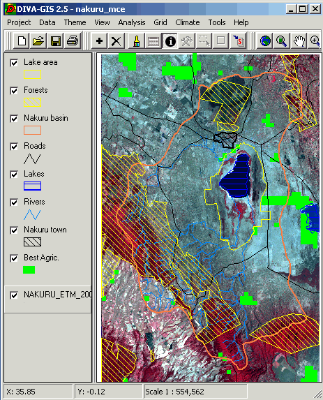
exercise you should create a map layout showing the most suitable areas for
commercial agriculture. In the example below all the constrains used are put on
the map to show that commercialization is not considered on those areas. When
you are satisfied Print or Export
the final map (under Project in the menu bar).
Appendix 1: How to get DIVA-GIS
from the internet
Use a web-browser (Netscape, Internet explorer) and navigate to the
homepage of DIVA-GIS at the International Potato Centre (http://www.cipotato.org/diva). Read
about DIVA-GIS and then press Download
(version
2.5 is the latest at the time of writing this instruction). Download both the
file diva2e.zip, also download the User Guide, DIVA-GIS2b.pdf.
Close all windows applications that are
running on your PC and install DIVA-GIS by executing the program diva2e.zip
(the program that you downloaded). To be able to install DIVA-GIS you must have
administrative rights on the computer you are using – if you do not have that
you must ask your system administrator to help you. When you install the
DIVA-GIS the default path for installation is “Program files\DIVA-GIS”. It is recommended that you accept that.
If you get stuck or do not understand a command, please refer to the User Guide that you downloaded (DIVA-GIS2b.pdf). This document is in pdf format, which you can read using Adobe acrobate reader. If you do not have acrobat reader on your computer you can download it from http://www.adobe.com/. Installation is done in a similar manner as the DIVA-GIS installation described above.
Appendix 2: Free data from the
internet used in this exercise
For more comprehensive information on data available over the internet
see the document Spatial
Data and Applications for Environmental Studies in Africa. The exercise
GIS Data Mining on
Internet introduces using ArcExplorer for direct linking to map resources
on the internet. It also includes examples of how to find and download other
datasets, including Digital Chart of the World (DCW), which is a comprehensive
dataset with global coverage. DCW data covering the RELMA countries (Uganda,
Ethiopia, Eritrea, Tanzania, Kenya and Zambia) is available on the RELMA_GIS1.0
CD (under …data/spatial/DCW). To import the DCW to
ArcExplorer you must use special software (Import71), which is also supplied on
the RELMA_GIS1.0 CD. It is however not trivial to import this data, but you can
find the instructions in the exercise Data Mining on
Internet.


