|
Institutionen för geovetenskaper Geoinformatiklaboratoriet |
GIS Exercise 6 October 1999 |
Thomas
Gumbricht |
DETECTING FAULTS
AND FRACTURE ZONES WITH VLF
|
Requirements The project requires
a PC with Windows95/98 or Windows NT, ArcView 3.0 (or later), and the ArcView
extensions Spatial Analyst and 3D Analyst. The necessary data are available
on the Earth server at Geocentrum: earth2/_Sharedfiles/geoinformatik/data/... |
|
Objectives The aim of the
project is to show how raw geophysical data is captured to GIS and how GIS
can be used for manipulating and interpreting such data in relation to other
data. The objective of the project is that the students should gain skills in
data capture and interpolation, as well as in image interpretation and
spatial data modeling. 3D visualization is introduced. |
|
Task To pass the exercise a thematic map showing interpreted VLF anomalies in a 3D scene must be handed in. |
Introduction
In the landscape a variety of both natural and human features act as electrical conductors. Among natural features, water filled tectonic zones are the most important conductors near the surface. Very Low Frequency (VLF) wavelengths (long wavelength) have frequencies in the band 10 to 30 kHz, those wavelengths have very good penetration in soil and water (they are used for broadcasting to submarines). Conductors close to the surface are induced by the VLF electromagnetic waves and thus give rise to secondary electromagnetic fields, with the same frequency as the primary electromagnetic waves. Conductors parallel to the source have the strongest secondary fields, and conductors perpendicular to the emitting source have almost negligible secondary fields.
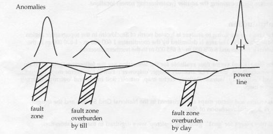
The strength of the secondary, induced, VLF signal can be used to detect tectonic zones, and is commonly used for locating aquifers in rocks. The strength of the signal from an aquifer (tectonic zone) is dependent on the size of the zone, the concentration of electrolytes in the water and the soil covering the zone. Aquifers cause more or less wide and high anomalies (changes in the secondary VLF field), depending on the extensions of the overburden, the material that covers the zones, and properties of the zone itself. A wide and deep extension of the zone will cause a stronger anomaly that a thin and shallow zone. A more conductive overburden will lead to a weaker anomaly. Overburden of clay will hence cause more damping than an overburden of till.
Power lines are good conductors, and will give rise to very distinct anomalies.
Electromagnetic VLF data over the study area (Örebro sv) is in the file ../geoinformatik/data/sgu/em10fsv.xyz. The data was collected from aeroplane, with a flight line separation of 200 meters (m) and a sampling interval of 40 m. Flight altitude was 30 m, and flight direction north-south. The detection instrument is a Dual-VLF receiver that measures the signal from two emitting sources (radio stations) simultaneously. The Swedish Geological Survey (SGU) have used airborne VLF (or RAMA) measurements since 1972. More information can be found on the home page of SGU – http://www.sgu.se/detsgu/geofysik/flyget/elekmagn/vlf_s.htm.
Preparing the raw data
The VLF data is supplied in exactly the
same format as the gamma radiometric data for the exercise Uranium gamma
radiation and radon gas risk. If you need more help have a look at that
exercise.
The data file is a matrix showing values flight line per flight line. The columns in the matrix represent east co-ordinate (Rikets nät – RAK 38), north co-ordinate (Rikets nät – RAK 38), RAMAXR (real component in X), RAMAXI (imaginary compnent in X), RAMAYR (real component in Y), RAMAYI (imaginary compnent in Y), RAMAZR (real component in Z), RAMAZI (imaginary compnent in Z), and RAMATOT (weighted total component). X and Y for the VLF/RAMA data are defined so that X is along the flight line (which is north-south in the data).
Line
1449800
/ RAK-Y
RAK-X RAMAXR RAMAXI RAMAYR
RAMAYI RAMAZR RAMAZI RAMATOT
1449800 6550000 -806 162 438
-40 -43 6
934
Remark: the Swedish co-ordinate system (RAK) uses X for the north-south axis. The GIS ArcView, however, puts X on the east-west axis. So in the example above Y and X (the two first columns) represent X and Y for the GIS (not Y and X as it shows – these are for RAK).
Open the file with the raw data (em10fsv.xyz) and have a look at it. The first thing you must do is to get rid of all strings with text and to change the non-recorded points to have a unique numerical value. In the raw data the non recorded points are marked with an asterisk “*”. (without quotation marks).
The first flight line is at easting 1449800 and the last at 1475200. As the flight lines are 200 meters apart the data set contains 128 flight lines. South is at 6550000 and North is at 6575000, with 40 m sampling interval this means 626 samples per flight line. To get the data into ArcView you must change it to comma delimited ASCII text.
|
1449800 6550000 -806
162 438 -40
-43 6 934 1449800,6550000,-806,162,438,-40,43,6,934 |
Raw data ArcView accepted format |
There is a prepared file with comma delimited data structure (../geoinformatik/data/sgu/em10fsv.txt) that you can use.
Digital
Elevation Model (DEM)
In the exercise you shall use a digital elevation model (DEM) in combination with the VLF data. To fit the interpolation of the VLF data to the same area and resolution as the DEM you must add the DEM to your view before interpolating. Start ArcView with a new empty project. Under File in the project menu check that the Extension Spatial Analyst is marked. Add the DEM –the DEM is in the form of a tif. File – thus you must add it as Image Source.
|
Theme |
Data directory ..data/arbetsstuga2000/arcview/ |
Meta data directory ..data/arbetsstuga2000/ |
|
Digital
elevation model |
..metria/hojddata/g10fsv.tif |
..html/hojd |
To convert the tif
file to a raster image in ArcView format go to the Theme menu and Convert To Grid. Save the Grid data set in your working directory.
Look at the Theme Properties of the DEM. The DEM has a resolution of 50
meters with 501 times 501 cells covering the study area. In comparison with
other data the values in Swedish DEM represent point values at nodes rather
than averages over cells – thus there are 501 instead of 500 values covering
the 25 km. To fit the VLF data to the DEM you must interpolate the VLF data to
the same system.
|
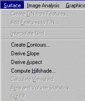
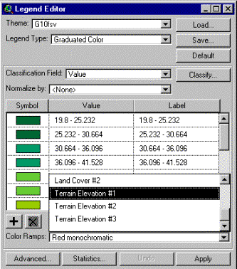
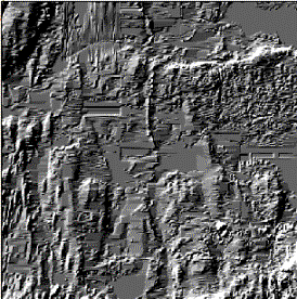
Before continuing have a look at the DEM. Open the Legend Editor and classify the DEM into 25 classes, and apply one of the special DEM Color Ramps (furthest down among the defined color ramps). Legend Type must be set to Graduated Color. Return to the View, make sure the DEM is the active theme and under Surface in the menu Compute Hillshade.
|
|
|
Have a look at the Hillshade that you just calculated. You shall now combine the Hillshade with the DEM. Make the DEM the active theme. Again open the Legend Editor and press the Advanced button in the lower left corner. Select the Hillshade as Brightness theme and Apply. Play around with the possibilities for setting color ramps and parameters for the brightness theme until you get a satisfying image – the aim is that you should be able to see the valley systems over the study area (indicative of tectonic zones). |
|
Interpolate the point data to a grid
Now we are ready to work with the VLF data. Click Tables in the project window, then click Add and navigate to the directory where you did put the matrix with comma delimited text (the extension should be .txt). Set List Files of Type to Delimited Text (*.txt). Add the data to your project. Open a new empty View. From the View menu select Add Event Theme. In the dialogue box that appears check that the correct columns are chosen for X and Y. Add the theme to the view. As the file is large it will take a while. Be patient.
Click the check box for the new theme – you will then see how data points are added flight line by flight line. Make the new theme active and Convert To Shapefile under Theme in the menu. Delete the original theme.
Before continuing you need to set map
units and distance units for the view. The theme that you have added (and the
ones you are going to add) are all in the co-ordinate system rikets nät. Rikets
nät uses meter as distance units. Under View in the menu choose Properties and set
map units to meters, distance units can be set to meters or kilometres.
To work with the VLF data you should interpolate it and convert it to a grid theme with the same extension and resolution as the DEM. From the View menu chose Surface and Interpolate Grid.. (if this option is not available it is because the extension Spatial Analyst is not running).
Set Output Grid Extent to be the same as for the DEM theme. Set Output Grid Cell Size to 50 or the same as DEM, Number Of Rows and Number Of Columns should both automatically become 501. Click OK. In the next dialogue box select interpolation method and Z field to interpolate – start with RAMATOT. It is recommended that you decrease the number of points for the interpolation to 6 (or a low fixed radius) as the interpolation routine is not very fast in ArcView.
Note: Spatial Analyst only supports two interpolation methods Inverse Distance Weights (IDW) and Spline. However, the programming language of ArcView (Avenue) supports more methods including Kriging – but to use them you must first learn to write the script for that (which is not to complicated though).The interpolation might take a few minutes (or even more). This is a good time for a coffee break.
Have a look at your interpolated surface. Check the range of values to make sure that you interpolated the correct Z value. Open the Theme Properties (under Theme in the menu). The resolution should be 50 meters and the number of rows and columns 501. Note that the Status is Temporary.
Classify the data
Open the Legend Editor to classify your data. In the legend editor Classify the data into 30 to 50 classes. Set Color Ramp to Full Spectrum and see if you can identify any anomalies. You probably can. The value range in the data is rather large, so you might encounter problems when classifying the data. When you are satisfied with your classification save it as a file and note the name of the legend file (you must load it later in the exercise). You can compare your image with the asme image produced by SGU by having a look in datorsal 3.
To see if any of the anomalies are related to faults and/or other structural features in the bedrock you should add the themes over tectonics and bedrock, also add a theme of wells:
|
Theme |
Data directory ..data/arbetsstuga2000/arcview/ |
Meta data directory ..data/arbetsstuga2000/ |
|
Tectonics |
..sgu/berg/tekt10f.shp |
..html/databesk |
|
Bedrock |
..sgu/berg/berg_10f.shp |
..html/kodberg |
|
Wells |
..sgu/brunnar/brunn10f.shp |
..html/brunn10f |
To see if any anomaly
is associated with the bedrock use the classifier to set the polygons of the
bedrock theme to transparent, but with boarders in black – thus you will see
the transition zones between various formations. Also display the vector data
with the DEM as background. You should be able to see the valley systems
associated with the tectonic zones.
Image enhancement
Image enhancement is
used for improving the visual interpretability of digital images. Image
enhancement methods include inter alia, classification, thresholding,
stretching and filtering. You already have classified your image. To enhance
the contrast between anomalies and the background VLF signal you should apply
an edge enhancement filter. Under the Analysis
menu choose Neighborhood
Statistics and apply a 5 x 5 or
larger size rectangular standard deviation filter. A standard deviation filter
gives a high value to the central pixel in the kernel when the variation in
numerical value among the pixels in the kernel is large (i.e. when you have an
edge or transition zone). As the fault zones give a wide anomaly (several
pixels wide) you need a filter of corresponding size.
Have a look at the
edge enhanced image use the Legend Editor to classify
the filtered theme – classify it by loading the legend file that you created
for the original VLF interpolated theme. You should be able to see more
anomalies on the edge enhanced image.
The filter types Range and Variety
also work as edge enhancement filters. Try those filters as well. Also try to
filter a filtered image. To test the difference between a filtered image and
its source use the Map Calculator under the Analysis menu.
Analyze the origin of
VLF anomalies
As you will have
noticed most anomalies are not related to the tectonic zones or transition
zones in the bedrock. To test the influence of power lines you should add the
theme from Gröna kartan that have this data. The theme with the power lines is P_10fsv
in the directory ../arbetsstuga2000/metria/gronkart/vector/. The theme P_10fsv
contains all kinds of line features and you must use the query builder to
extract only power lines. Have a look in the html file
..arbetsstuga2000/html/kodgron to find out the numerical code for power lines.
Use the Query
Builder to select those values.
When you have the power lines selected use the Convert to Shapefile option under the Theme menu to create a theme with only the power
lines. Add the new theme to the view. There is no doubt that power lines are
the major causes of the large and distinct anomalies seen in the image.
With the power lines
displayed on top of the VLF data try to identify fault zones in your image.
Screen digitize the fault zones – if you do not know screen digitizing have a
look at the exercise Introduction to screen digitizing, or the exercise Vector
data and topology.
As you can see from
the themes with tectonic zones and power lines, the former have more of an
east-west orientation while the latter are more north-south oriented. Thus when
it becomes your turn you should try to use the VLF component that enhances the
east-west but not the north-south structures.
Further image
enhancement
As the anomalies
caused by the power lines are larger than the other anomalies, we want to get
rid of the anomalies caused by the power lines. The general steps for that is
to calculate distances from the power lines and set the value of the cells
affected by power lines to zero, or an average value. The first option is
simpler but then you should use the image with filtered standard deviation
values as input (where zero equals no variation). Note that many power lines
run in valleys, and hence you will also loose any natural anomaly by following
the suggested enhancement steps.
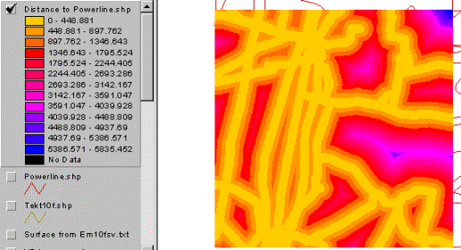
Make sure the power
lines is the active theme, under the Analysis
menu Find
Distance. Set output grid
properties to be equal the existing grid files (the DEM and the interpolated
VLF signal).
|
|
Have a look at the
result, if the values are wrong, your map and distance units are probably not
correct. In order to identify all areas affected by the power lines you can use
the Map Query function under the Analysis menu. Query the proximity grid theme for
values larger than 200 meters – the result should be a Boolean image having the
value 0 at all points closer to power lines then 200 meters and the value 1 for
all other locations. This image can be used as a mask for changing the VLF
values of all cells affected by the power lines. Just multiply the mask and the
theme with the filtered standard deviation.
To analyze the
difference in VLF signal between cells affected by the power lines and
unaffected cells make sure that the Query you just did is the active theme. In
the Analysis menu do Summarize Zones. Select one
of the grid themes with the VLF anomaly (whether filtered or not depend on how
you want to proceed) as theme containing variable to summarize. Analyze the
result – it will be obvious that the anomalies from power lines have higher
values.
|
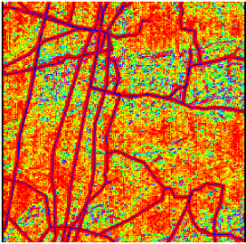
The image to the right
shows the VLF anomaly after filtration with a standard deviation filter and
with all cells affected by power lines, and other extreme values, forced to
zero (no variation). The remaining anomalies (mainly caused by natural
features) are more easily detected. The whole process for creating the image
to the right was a combination of thresholdning and stretching. The image
could be used for on screen digitizing of anomalies. |
|
3 D visualization
|
Go to the project
window and start the 3D analyst Extension
under the File menu. Return to the view. Make sure the DEM
is the active theme. Under Theme in the menu choose Convert Grid to TIN, accept the default values suggested for
conversion. Save the TIN in your working directory. Do not add the theme to
the View. Instead close the view and return to the project window. A new type
of document 3D
Scenes has been added to the
project window – but you must use the scroll bar to see it. Click on the 3D scenes icon and then New
to create a 3D scene in your project. The 3D scene consists of two windows –
one viewer and one table of content. With the 3D scene active use the Add theme button to add the TIN theme that you created
from the DEM. Navigate to the directory where you saved the TIN, remember to
change the Data
Source Type to TIN Data Source. Use the little sail ship, |
|
Most of the other
tools in the 3D scene are familiar. There are a few new ones, including Select Features, ![]() , and Rotate Viewer,
, and Rotate Viewer,![]() .
.
There is almost no
vertical resolution in the 3D scene that you created. To set the 3D
exaggeration factor press 3D scene in the menu and
then Properties. Use the Calculate
button next to the Vertical Exaggeration Factor,
and Apply. In the 3D scene Properties you can also change the change the sun azimuth and sun
altitude of the 3D scene – try to
change them to see what happens.
The next step is to
add the tectonic zones to your 3D scene. Again use the Add theme button, and add the shape file with the
tectonic zones (..sgu/berg/tekt10f.shp). Make the theme active and under the Theme menu choose Convert to 3D Shape File. For Z value
you should choose surface (default). Save the 3D shape file in your
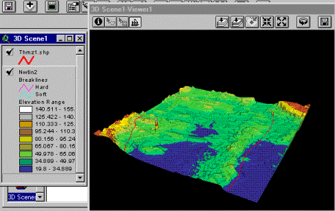
working directory and add it to the 3D scene. In the 3D scene below the Color Ramp has been changed a little to highlight the low
laying areas as lakes. You should have approximately the same 3D scene.
|
|
Your turn
The task for the
exercise is that you should use interpolation and image enhancement to identify
faults in the study areas. These faults should be digitized as line features.
The line features should be converted to 3D and displayed in the 3D scene over
the area.
Start by interpolating
the real and imaginary components of the X and Z directions. The X component enhances the east-west
structures. As a ninety degree angle between direction of the signal and the
strike of the structure is optimal for detection, the X component carry most
information on the east-west running tectonic zones. Also the Z component can
reveal more information.
Use image enhancement
methods (filtering, thresholding, classification, map calculation) to identify
the faults in the area. Create a new theme and use screen digitizing to capture
the faults you identify. Convert the faults to 3D shape format and add them to
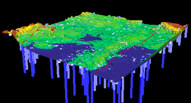
the 3D scene that you already created. To test the idea of fault zones being
aquifers you can use the theme with well data (brunnar) supplied with SGU. In
the figure below the wells are displayed on the 3D surface extruding downwards
(negative values) dependent on water capacity (this classification is done in
the 3D properties of the theme). The 3D scene should be handed in to pass the
exercise; you can choose to send it in as paper or electronically. Do not
forget to put your name on the handin.
|
|

