|
Institutionen för
geovetenskaper Geoinformatiklaboratoriet |
GIS Exercise 7 September 1999 |
Thomas
Gumbricht Stefan
Haglund |
TIRES AND TRAVEL IN ÖREBRO
|
Requirements This exercise requires a PC with Windows 95/98 or Windows NT and the
GIS software ArcView 3.0 or later. The necessary data are available under the
archive /data/Arbetsstuga2000/arcveiw/ on the course CD as well as the Earth
server at Geocentrum:
earth2/_Sharedfiles/geoinformatik/data/arbetsstuga2000/arcview/. |
Objectives
The aim of the exercise is to work with attribute data,
manipulate tables and create and display statistics with the chart functions
in ArcVeiw. The student will receive an introduction to working with tabular
data and creating charts to display various properties. |
Task
To pass the exercise you should hand in a map showing postal areas
selected for an ad campaign, with pie charts showing the number of
inhabitants divided in age-groups, and a bar showing the number of cars per
household. |
Adding the necessary data
A tire producer wants to distribute advertisements in postal code areas
surrounding Örebro commune. The producer believes that people living within
urban Örebro to a large extent uses public transportation for their travel to
and from work. He wants to focus his campaign on the likely commuters just
outside Örebro. Hence he wants to select postal code areas surrounding the
urban area for delivering 2000 ad flyers to what he believes the most potential
tire customers.
Start
the exercise by opening a new View. Open the themes with built up areas (Rt_to) from …/data/Metria/Rodakartan and postal areas (P18ed) from …/data/metria/Scb.
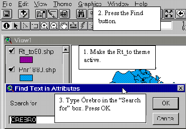
Make the Rt_to theme active and use the Find Button  to select Örebro (you can also choose Find... in the Table menu).
|
|
When ArcView has found Örebro (or any other searched feature) it will
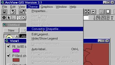
automatically select the feature. When this is done, go to the Theme menu and choose Convert to shapefile. The command convert
to shapefile will convert selected features in to a shapefile containing only the
selected features. If no features are selected the entire theme will be
converted to a new shapefile.
|
|
In the dialogue box that appears, navigate to your working directory
and save the file as Öreurv. |
Now that you have a theme which only displays the urban area of Örebro,
you will use this theme to find out which postal areas are surrounding urban
Örebro. With the Select by
theme function
under the Theme menu you can select
features in the active theme that have different relations to features in other
themes.
You want to select postal areas that are closely surrounding Örebro but
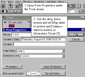
not actually within the area. To be able to make selection based on distance, you must first tell
ArcView how to measure distance. This is done by setting the Map and Distance units under View
properties menu.
|
|
Map units is the
co-ordinate units in which the data you have added is stored on your disk.
All the data you are using is in the co-ordinate system rikets nät, which
uses meters as units. Distance
units
are the units in which ArcView will display measurements and dimensions while
you work. This can be set to the units most suitable for each view, in this
case metres or kilometres. |
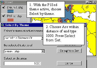
Now you are ready to make the selection based on distance. By using the
Are within distance
of
function under the Select by
theme
menu, you can select features that are within a certain distance (in this case
1000 m is suitable) of Örebro. If you choose this command directly, ArcView
will select all areas that are within 1000 m, including those inside the urban
area (which you do not want). To get around this problem, first use the select
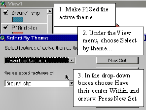
by theme command “Have their
centre within” and choose Öreurv as the
“receiving” theme. You must thus make the P18ed them active.
|
|
This will select all postal areas that are inside urban Örebro. Now open the attribute table for P18ed and use the Switch selection button |
After you
have switched the selections, open the Select by theme dialogue box again. This
time, choose are within distance of and type 1000 m (or 1 if
you chose km as Distance units) to select all postal areas that are 1000 m from
urban Örebro.
|
|
In the Select by theme dialogue box, press Select from set to select
postal areas from those already selected.
When this operation is finished, you have selected postal areas that
are within 1000 m of urban Örebro but outside the urban area. |
You should now save this selection to a separate theme. This is done
under the Theme menu where you choose
Convert to shapefile (see above).
Navigate to your working directory and save the file as Orepnromr.
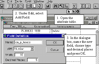
You are now going to start working with the attribute data found in the table. The selection of postal areas should be based on how many cars there are per household, in order to reach the largest number of possible clients. In the table for P18ed, data is available for number of cars and number of households separately, why you have to create a new field showing number of cars per household. To accomplish this, you must open the table for the Orepnomr theme and add a new field to it, where statistics on cars per household should be calculated. You need to press Start editing under the Table menu to start making changes in the table. When you are ready to start editing, go to the Edit menu (the table should be the active document) and select Add field. Name the new field car_p_house. The values in this column should contain the number (thus select number as field type) of cars in the postal areas divided by the number of households in each postal area. Also set the number of decimals to 5.
|
|
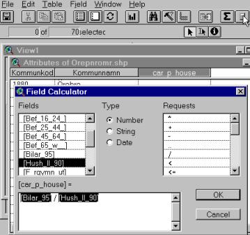
To calculate the number of cars per household in each postal area you
need to mark the new car_p_house column (it will appear darker like below).
Choose calculate from either the field menu or the Calculate button ![]() .
.
|
3. Click on the fields and requests
to design your operation, press OK. 1. Select the field where you want
the results. (car_p_house) 2. Press the calculate button. |
When the car_p_house field is
selected, it appears shaded (see picture). To make the calculation, first press the Calculate button and then
double-click on the Fields and Requests necessary to
complete the calculation. Finally press OK. When you are done, go to the table menu and Stop editing. |
Since there are only 2000 fliers you must identify areas that together
do not exceed this number. These areas also must have a high ratio of cars per
household. In the vicinity of Örebro, many people can be expected to commute to
the urban areas for work. Many of these travel by car and thus need new tires
more often.
To select the postal areas that together does not exceed 2000 households
and that you have sorted according to number of cars per household you should
make the attribute table of Orepnomr active. With the
left mouse button, select a number household fields in the attribute table that
you estimate will add up to 2000. Then select Statistics under the Field
menu.
Add or remove fields until you get as close to 2000 as possible. When you are
satisfied, save the new map as a shapefile and add it to the view. (Name it,
e.g. 2k.)
When you
have your selection you should make a map to present your findings. Further
than wanting to know the number of cars per household in the different postal
areas the tire producer also is interested in information about the age
structure in the postal areas. You should therefore create two types of charts
for the final map.
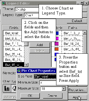
The first chart should represent the age structure as well as the total number of people in the postal areas. To express multiple attributes on one map, a pie chart is useful. In the attribute table for 2k there is information on the number of persons within each age group that will be used in the creation of the chart. The pie chart shall consist of pie “slices” representing the different age groups and the size of the pie should represent the total population. To create this chart, open the Legend editor and for Legend Type and choose Chart as Legend type. The legend editor will then change its appearance and you will find more choices. To the left, in the Fields menu, select all fields with age groups and press Add at the center of window. (You can select all fields in one step by holding down the Shift key when selecting them.)
|
|
You should also select Bef_totalt as the field
which should determine the size of the pie
chart. Press Properties and select Bef_totalt in the Size field box. You must
also select a size range for the charts
in the Properties box. Press OK.
You can also select suitable colours for the pie slices by double
clicking in the Symbols field in the Legend editor. When you are
done, press Apply. Now you are finished with the first chart. |
The second chart should be a column
chart
where the height of the column should represent the number of cars per
household in each postal area. Since it is not possible to have two legend types
on one theme you have to create a new theme with the same information as the 2k theme. If you would simply
duplicate the 2k theme (by converting the entire theme to a new shapefile) you
would get the two charts on top of each other. To avoid this you must create a
new Point theme under the View menu. Choose Point as Feature Type and save the new theme in your directory as Pointchart. When the new theme appears
it will be ready for editing. You should now digitise points in each one of the
postal areas and then join the table from the 2k theme to add information from that table to the
point theme’s table. To digitise your first point, use the Draw Point tool ![]() and set a point in one of the postal areas.
(Be careful where you place the points so it does not get in the way of the pie
charts.) When you have placed the first point you must find a value unique to
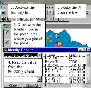
each postal area that you will edit into the ID field in the attribute table for Pointchart. The identifier unique to postal areas is the Pnr1880_id field. Make the 2k theme active and click on
the Identify tool
and set a point in one of the postal areas.
(Be careful where you place the points so it does not get in the way of the pie
charts.) When you have placed the first point you must find a value unique to
each postal area that you will edit into the ID field in the attribute table for Pointchart. The identifier unique to postal areas is the Pnr1880_id field. Make the 2k theme active and click on
the Identify tool ![]() and with the tool active, click in the postal
area where you placed the point.
and with the tool active, click in the postal
area where you placed the point.
|
|
The Identify tool displays all information
from the chosen field in the Identify
Results window. The read value from the Pnr1880_id field you should type
into the ID field of the
attribute table of the Pointchart theme. Use the Edit button |
Follow the same steps with the rest of the postal areas. Remember that
you must have the 2k theme active when you identify the Pnr1880_id’s and the
Pointchart them active when you digitise the points! When you are done, Stop editing under the Table menu and say “yes” to save the edits.
To be able to make a chart with the new point theme you must add
information from the 2k theme. This is
done with the Join Table operation. You
are going to use the information from the fields Pnr1880_id and the ID field to link
the two tables together. The values in these fields are identical, and ArcView
will transfer the data from 2k to Pointchart so that the information
connected with a certain value (e.g. 67) in Pnr1880_id is sent to the corresponding ID field in the attribute
table for.
To perform the Join
table
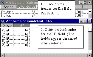
operation you must thus open the tables for 2k and Pointchart. With both
tables open, click first on the header of the Pnr1880_id field. Then click on the header of the ID field and finally the Join Table button ![]() .
.
|
|
You should first click on the field from the table you want to
“export” data from, i.e. the 2k table. Then
click on the field where you want the data to go (or be “imported” to) i.e.
the Pointchart table. Finally
click the Join button |
When you have completed the join successfully, you will see that all
records from the 2k table are
inserted in the Pointchart table. You can
now start making the column charts.
As you could see when making the pie charts earlier, charts can be
created through the Legend editor. Thus open the
legend editor for the Pointchart theme by double
clicking on the legend symbol. Choose Chart as Legend Type and Add the car_p_house field. This time, you
should make a column chart so you must select this chart type by clicking on
its symbol ![]() in the lower left corner of the legend editor. Set the size range of the charts in the Properties window (you must click
on Properties to open the
window). Make sure that the placement and the sizes of the chart are OK and
adjust them if necessary. To move the charts, make the Pointchart them active and use the Pointer tool
in the lower left corner of the legend editor. Set the size range of the charts in the Properties window (you must click
on Properties to open the
window). Make sure that the placement and the sizes of the chart are OK and
adjust them if necessary. To move the charts, make the Pointchart them active and use the Pointer tool ![]() to select and move the charts into a new
position.
to select and move the charts into a new
position.
Finally make a layout where you add an appropriate title and set the scale bar and north arrow. Also add the road theme (Rt_av) from rodakartan to
simplify orientation in the map. To change the features of the Layout, double click on the
features and edit them. You can change the size and style of the text in the
title by choosing Show Symbol
Window
under the Window menu and
clicking on the Font Palette ![]() .
.
To pass the exercise, hand in the layout as specified in paper or
digital format to the teachers. To hand it in digitally, make the layout the active document and
under the File menu, choose Export. Under the List of File Types, choose JPEG. Export the JPEG file to
your working directory and send it as an attachment in an e-mail to one of the
teachers.
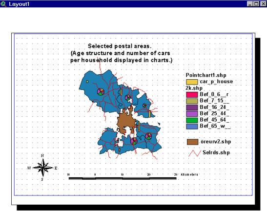
Below is an example of how
the final layout can look.
|
|

