|
|
GIS Exercise 16 November 2004 |
Thomas
Gumbricht |
Introduction to GIS and Satellite Data Analysis – Okavango Delta, Botswana
|
Requirements This exercise
requires a PC with Windows 95/98/2000/NT/XP, or later and the freeware DIVA
GIS 4.1. To download and install DIVA GIS see appendix 1. The necessary data
are available on the OKA_GIS1.0 CD. Sources of internet available data are
given in appendix 2, and in the document Spatial
Data and Applications for Environmental Studies in Africa. |
|
Recommended prerequisites It is recommended that you do the exercise Introduction
to GIS and digital cartography using DIVA GIS before doing this exercise.
|
|
Objectives This exercise will give an introduction to
GIS and satellite data analysis using the DIVA GIS freeware. To illustrate
the exercise different freely available data over the Okavango Delta in
Botswana will be used. The objective of the exercise is that the students
should gain basic insight into using GIS and satellite images for analysing
natural resources. After completing the exercise students should understand
the usefulness of GIS and (RS) sensing for natural resources management. |
Start the GIS freeware ArcExplorer and add data
Start DIVA GIS, ![]() and Save,
and Save, ![]() the
DIVA GIS project, preferably in your home directory. Change the name into
something logical. Remember to save the project frequently in case you should
cause the program to crash or loose power supply.
the
DIVA GIS project, preferably in your home directory. Change the name into
something logical. Remember to save the project frequently in case you should
cause the program to crash or loose power supply.
The
first step is to have a look at a time series of five satellite images over the
Okavango Delta in Botswana. The images cover the period 1963 to 2000 and
represent different generation of high resolution satellite sensors.
|
Sensor |
Image
dates |
Comment |
Directory
and file name |
|
Corona |
1962
and 1963 |
Old
black and wihite “spy”images, winter situation with large flood. |
D:\oka\Oka-Delta\Corona\1963-corona\
oka_1963_bw.tif |
|
Landsat MSS |
1979 |
60 m resolution color, winter situation with large flood. |
D:\oka\Oka-Delta\Landsat\1979-mss\ oka_1979_mss_natural.tif |
|
Landsat TM |
1990/91/92 |
30 m resolution color, |
D:\oka\Oka-Delta\Landsat\1990-tm\ oka_1990_tm_natural.tif |
|
Landsat TM |
1989/1994 |
30 m resolution color |
D:\oka\Oka-Delta\Landsat\1994-tm\ oka_1994_tm_natural.tif |
|
Landsat ETM |
2000 |
30 m resolution color, autumn situation with flood formed by local
rainfall over the Delta. |
D:\oka\Oka-Delta\Landsat\2000-etm\ oka_2000_etm_natural.tif |
Details about the satellite images and the processing done to derive the
color maps is in the document ??.
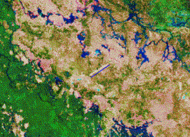
Use the Add Theme button, ![]() , navigate to the directory with the 2000
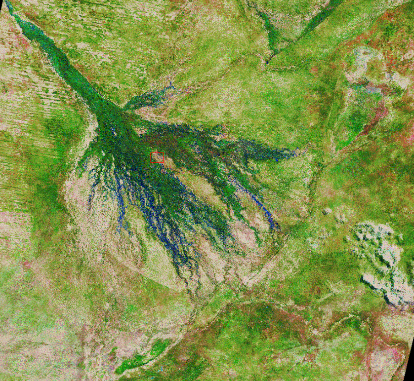
Landsat ETM image and load the image oka_2000_etm_natural.tif. This is an ordinary tif
file that is geo-referenced through a header file with the same name, but the
extension “.tfw”. The image is composed of four individual Landsat ETM
scenes, all from the first half of April in 2000. Rainfall over central
Southern Africa in the first half of 2000 was unusually high, which is
reflected in the image; the flooding of the Okavango is relatively large and
the surrounding Kalahari desert is comparatively green from rainfed vegetation
growth. The blue water in the lower reaches of the Okavango represent fresh
flood-water without vegetation, whereas the flooded regions of the Panhandle
and Permanent swamps are green as a consequence of dense swamp vegetation (e.g.
reed, papyrus and various sedges). The flooding in the upper reaches is also
not very large, which is related to the fact that rainfall in the Angolan
highlands (that feeds the Okavango Delta with most of its water) was smaller
than usual in 2000. In the composite image you can also see some clouds in the
lower right corner, the Linyanti swamp to the North, and Mababe depression and
Lake Ngami which are two former lakes that are presently dry.
, navigate to the directory with the 2000
Landsat ETM image and load the image oka_2000_etm_natural.tif. This is an ordinary tif
file that is geo-referenced through a header file with the same name, but the
extension “.tfw”. The image is composed of four individual Landsat ETM
scenes, all from the first half of April in 2000. Rainfall over central
Southern Africa in the first half of 2000 was unusually high, which is
reflected in the image; the flooding of the Okavango is relatively large and
the surrounding Kalahari desert is comparatively green from rainfed vegetation
growth. The blue water in the lower reaches of the Okavango represent fresh
flood-water without vegetation, whereas the flooded regions of the Panhandle
and Permanent swamps are green as a consequence of dense swamp vegetation (e.g.
reed, papyrus and various sedges). The flooding in the upper reaches is also
not very large, which is related to the fact that rainfall in the Angolan
highlands (that feeds the Okavango Delta with most of its water) was smaller
than usual in 2000. In the composite image you can also see some clouds in the
lower right corner, the Linyanti swamp to the North, and Mababe depression and
Lake Ngami which are two former lakes that are presently dry.



Map projection and units
Before continuing we need to make sure
that we have correctly defined units in our map. Use the Zoom In tool, ![]() to
zoom to a scale of around 1:50 000, which is about the scale at which the
images starts to look “grainy”. I have used the Mombo airfield on the Northern
tip of Chief’s island (indicated with a red rectangle in the image above) as an
example here. The scale of your image
is displayed together with the x and y coordinates of the cursor in the lower
left corner of the View,
to
zoom to a scale of around 1:50 000, which is about the scale at which the
images starts to look “grainy”. I have used the Mombo airfield on the Northern
tip of Chief’s island (indicated with a red rectangle in the image above) as an
example here. The scale of your image
is displayed together with the x and y coordinates of the cursor in the lower
left corner of the View, ![]() .
.
|
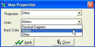
If your scale does not seem to be
correct, it is because your map units are not correctly defined. Under Map in
the main menu, select Properties and set the Projecton to “Other” and Units
to “Meters”. Click Apply. To check if the settings are correct, you can
measure the length of the Mombo airfield in the 2000 composite image – click
the Distance tool,
|
|
All the maps and images on the Oka_DWD are projected to Universal Tranverse Mercator (UTM) zone 34 South. Apart from a projection a map must also have a Datum, that describes how the Earth’s form is represented in the projection (the Earth is not completely round). For the Oka_DWD we have used the WGS-84 datum as this is often the default datum when ordering satellite images, or in a GPS. If you do not want your map to contain negative coordinates, you must also define a startpoint in X and Y. This is called false easting and false northing, and for the maps on the Oka_DWD we have set false Easting = 500 000, and false Norting 10 000 000. This is only important if you want to combine the data with your own GPS or data from other sources. How to set the GPS is given in the exercise .??
Satellite time series analysis
The next thing to do is to compare the
situation in and around the Okavango over time. For this we will use the set of
georeferenced satellite images listed above. Use the Add theme tool, ![]() , (or go via Layer, Add layer in the menu) to
add the other files listed in the table above. As they are all georefererenced
(see above) they all fit on top of each other. The precision in the geometry is
around 50 metres, and each image cell is 30 m (Landsat TM and ETM), 60 m
(Landsat MSS) or 120 m (Corona). The 1994 for composite represent a very dry
year, whereas the 1990 composite is an intermediate year. In the 1990 image the
boundaries of the different scenes can be clearly seen as the vegetation and
flooding situation is quite different. The flood in 1963 is among the highest
seen over the last 50 years, and also the 1979 flood is relatively large.
, (or go via Layer, Add layer in the menu) to
add the other files listed in the table above. As they are all georefererenced
(see above) they all fit on top of each other. The precision in the geometry is
around 50 metres, and each image cell is 30 m (Landsat TM and ETM), 60 m
(Landsat MSS) or 120 m (Corona). The 1994 for composite represent a very dry
year, whereas the 1990 composite is an intermediate year. In the 1990 image the
boundaries of the different scenes can be clearly seen as the vegetation and
flooding situation is quite different. The flood in 1963 is among the highest
seen over the last 50 years, and also the 1979 flood is relatively large.
|
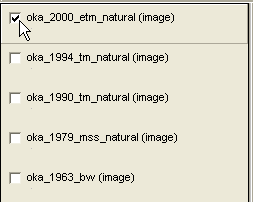
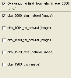
Use the Legend to turn the different themes on and off. Click the check box to the left of the theme name, as shown to the right. If your computer is a bit slow, you can choose to just have one theme open at a time. To close a Theme, you go to Layer in the main menu and select Remove Layer. This only removes the layer from your DIVA GIS project, the theme will still be on the harddrive so you can add it again at any time.
|
|
Let us use the time-series of images to
see how one of the recently built airfields would have faired in the years with
more plentiful floods. If you followed the instructions you know where to find
the Mombo airfield. Use the Zoom in tool, ![]() , and then the Pan tool,
, and then the Pan tool, ![]() , to navigate to Mombo airfield. You can now
toggle between the images to have a look at the flooding situation around Mombo
airfield in 1963,1979, 1990, 1994 and 2000.
, to navigate to Mombo airfield. You can now
toggle between the images to have a look at the flooding situation around Mombo
airfield in 1963,1979, 1990, 1994 and 2000.
|
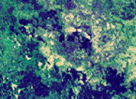
Corona 1963 |
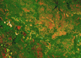
Landsat MSS 1979 |
|
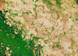
Landsat TM
1990 |
Landsat TM
1994 |
The images nicely illustrate the fast development in Earth Observation Remote Sensing. The early image (Corona 1963) is black and white (Pancromatic) at 120 m resolution. The first Landsat series contained the Multi Spectral Scanner (MSS) that had a resolution of 57 m, and observed reflectance “colors” in four bands (or wavelengths). The Landsat TM had a resolution of 28.5 m and 7 bands. The Landsat ETM also had 28.5 m resolution in 7 multispectral bands, but also uses a panchromatic sensor at 14.25 m resolution. Hence the quality of the images (and their use in different studies) has improved greatly over time. The images also very nicely illustrate the large variations that signify the Okavango Delta. 1994 was a very dry year, 1979 saw a large flood from the Angolan highlands (where the tributaries of the Okavango river raises), and the 2000 flood was generated from rainfall directly over the Detla surface. 1990 is the most “normal” of the years for which we have full coverage of these high resolution satellite images.
You will soon discover however, that it is difficult to remember the position of the airfield as it is only seen in the 2000 image (it was simply not built until after 1994). The ideal solution is to have a vector (point, line or polygon in GIS jargon) that identifies the airfield, and that can be displayed on top of each images. Unfortunately we do not have a line that represent the Mombo airfield, so we must create one.
Screen digitalisation
A simple way to create and add data to your GIS is to digitise georeferenced data directly on the screen on top of a georeferenced image. It will be introduce din this exercise and further elaborated in the exercies on capturing GPS data.
Make sure that the 2000 composite that contains the airfield is seen in the view. Either put it on top in the legend by grabbing it with the left mouse button, holding the button pressend down and sliding the theme to the top of the Legend. Or simply use the click box to turn all other themes off. Or remove all other images (if you have a slow computer this is recommended).
|
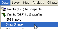
Under Data in the main menu you find several options for capturing additional data to your GIS. Choose the Draw Shape option as shown to the right. |
|
|
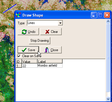
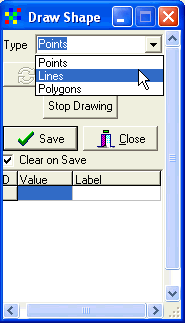
In the Draw Shape dialogue box select Type to be Line in the Drop down menu as shown to the right. Use the mouse to digitise a line representing the Mombo airfield. The line only needs two nodes – a starting node and an ending node. To finish digitising the line, double click on the end point (so in all you need to click three times to create the airfield line vector, once at the starting point and a double click on the end point). In principle you can digitise a line with thousands nodes. But for now the straight line representing the airfield is enough. When you have finished digitising you will be returned to the Draw shape dialogue box as shown below (also the digitised line representing the airfield is shown).
|
|
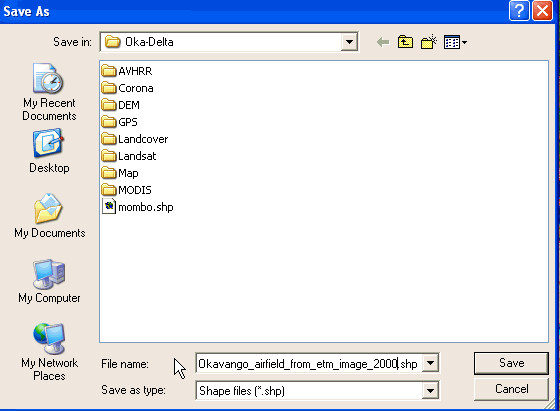
Fill in a value and a label for your newly created vector (I gave the value “22” and Label “Mombo airfield”), and press the Save button. Navigate to a directory where you want the vector to be saved – the file format is a shape (.shp) file, which is the standard ArcView and ArcGIS vector format (so your digitised line will be available for all GIS programs). Giveit a logical name (I prefer long descriptive names, preferably with dates and even projection, that will help a lot when retrieving the data later).
Your newly created theme will be added
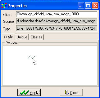
as the top entry in the Legend. Click the Properties tool, ![]() , (or double click on the theme in the
legend) to get to the Properties dialogue box. Click on the line symbol get to
the Symbol dialogue box, and change the color and Size of the line vector that
you just created. Remember to click OK and Apply to make the changes also in the
View.
, (or double click on the theme in the
legend) to get to the Properties dialogue box. Click on the line symbol get to
the Symbol dialogue box, and change the color and Size of the line vector that
you just created. Remember to click OK and Apply to make the changes also in the
View.
|
|
|
Make sure that the theme with the
digitised airfield is the active theme (i.e. appears lifted), then choose the
Identify Feature tool, ![]() , (the cursor will get a small
, (the cursor will get a small ![]() attached to it) and click on the line representing Mombo airfield
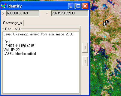
in the View. The attribute data (the database going along with the vector) will
be displayed. In my example you can see that the vetor got an automatic ID
number, the length was calculated and the Value and Label I gave are also in
attribute table.
attached to it) and click on the line representing Mombo airfield
in the View. The attribute data (the database going along with the vector) will
be displayed. In my example you can see that the vetor got an automatic ID
number, the length was calculated and the Value and Label I gave are also in
attribute table.
Now you can return to the satellite images representing the earlier years and look at the situation at the exact spot which is today occupied by the Mombo airfield. If those who say that large floods will again return (including prof. Spike McCarthy at Wits university) are right, the Mombo airfield will probably not be accessible all year around.
